Pablo Center at the Confluence
Building an Identity to inspire a ripple effect of creation.
Mission
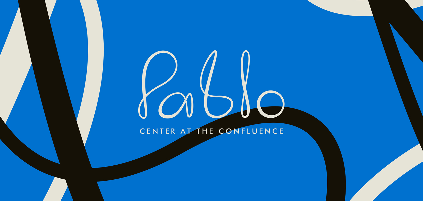
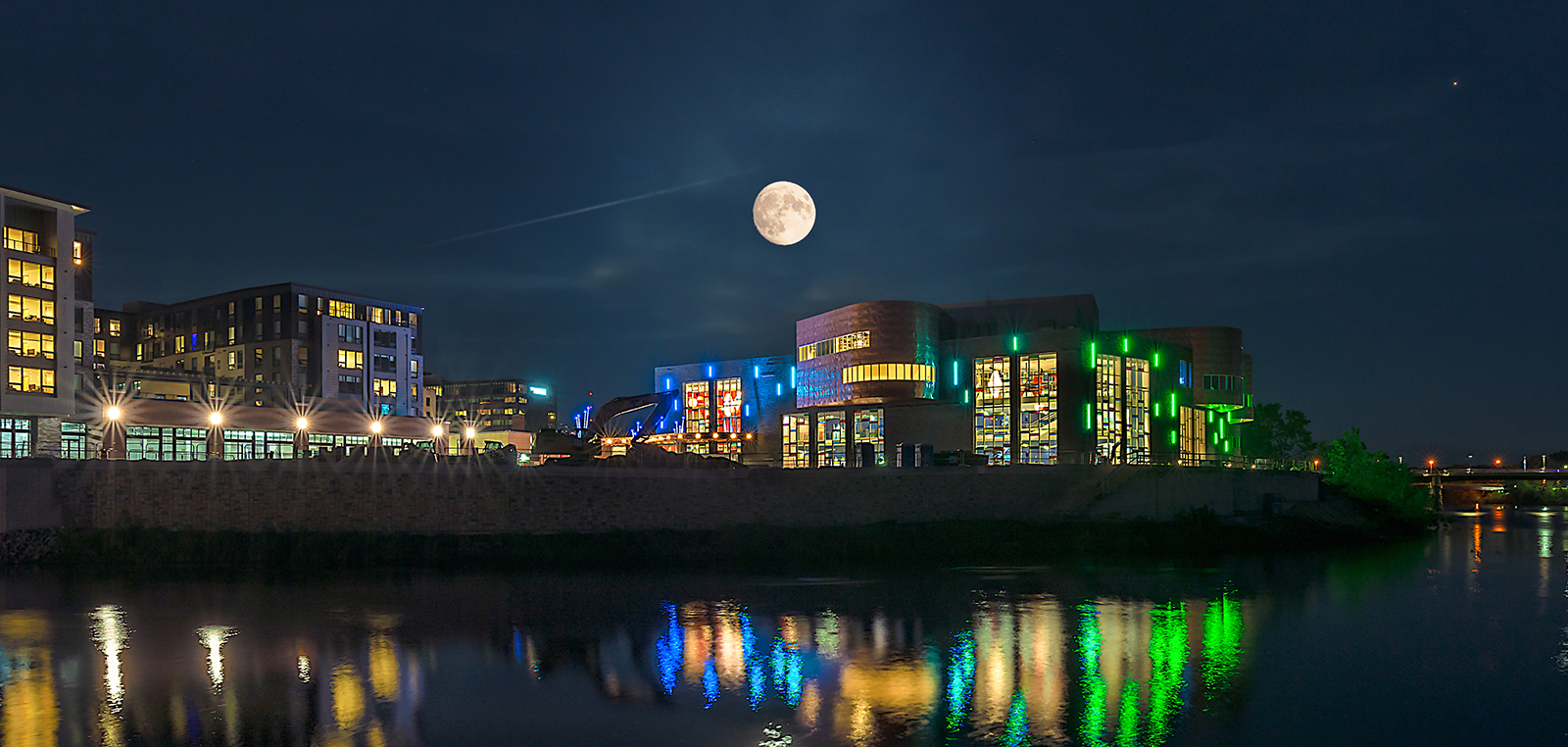
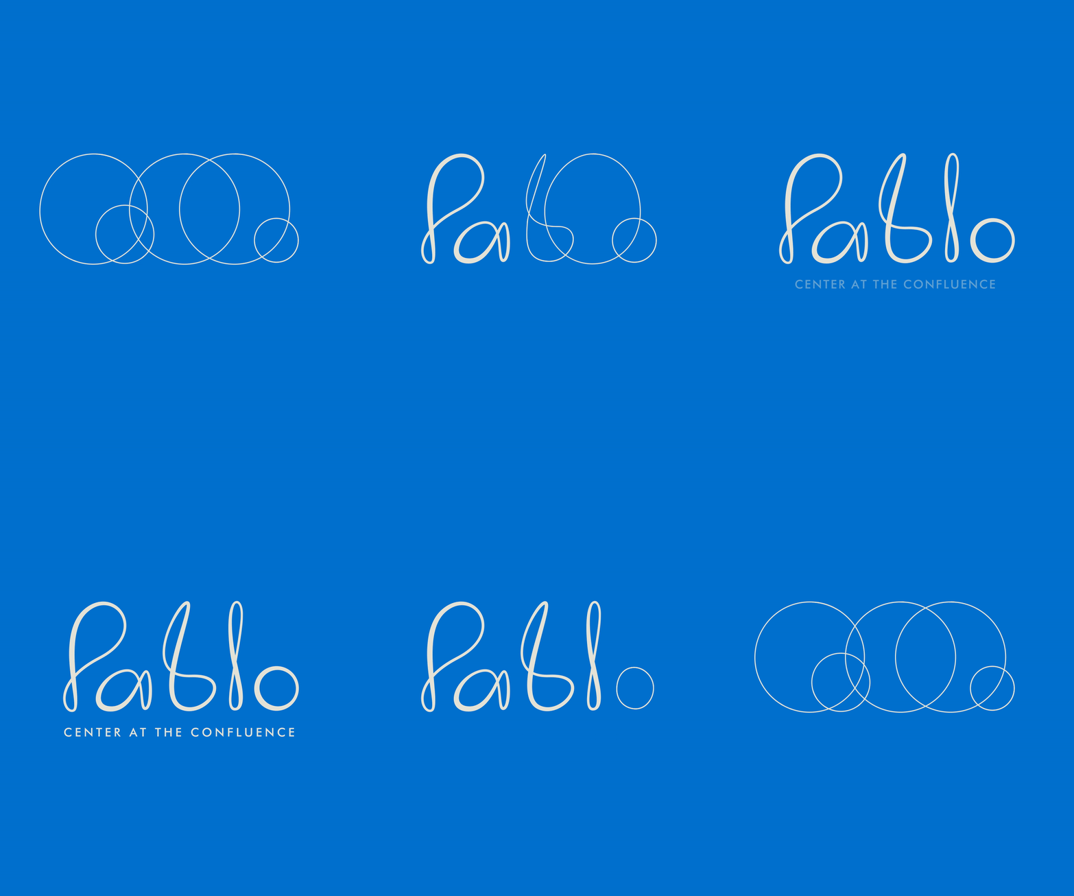
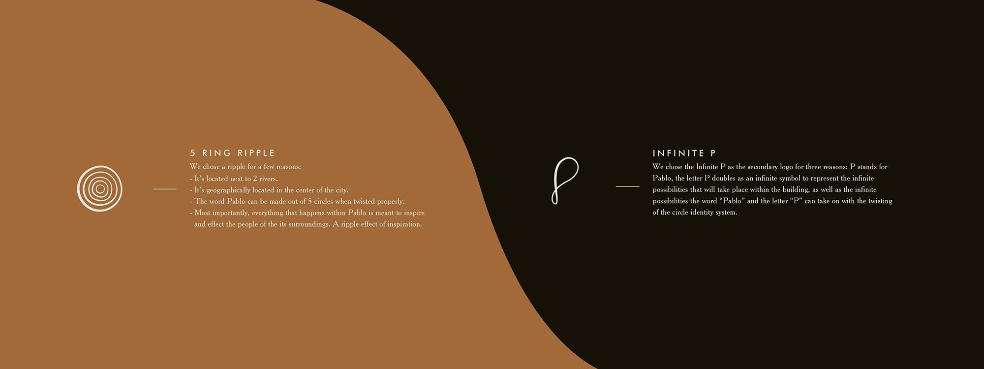
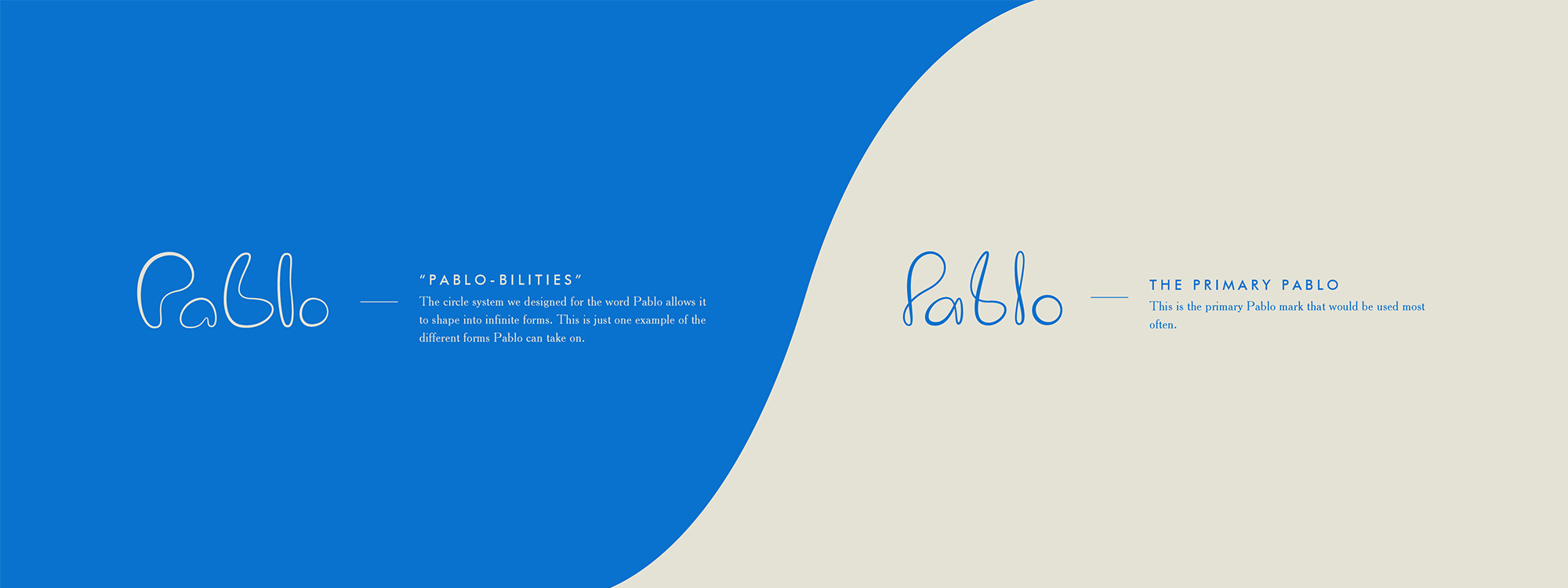
Our mission was to create an identity that was flexible, fluid, and dynamic. Just like the Chippewa Valley arts scene itself. The logo evolution shows each step of how the Pablo wordmark transforms from a drop of water to a ripple, to the secondary logo, to different forms of Pablo, and then to the official wordmark. Pablo’s goal isn’t just to have people come to shows, but to leave them inspired to bring that energy back into their community. Without the love and passion people have had for the arts in the Chippewa Valley for decades, Pablo would not exist. A full circle ripple effect, if you will. Nestled in the Confluence of the Eau Claire and Chippewa Rivers, Pablo Center at The Confluence is not just “A Center” but “The Center” of Eau Claire. The beginning of a new ripple effect.
Identity
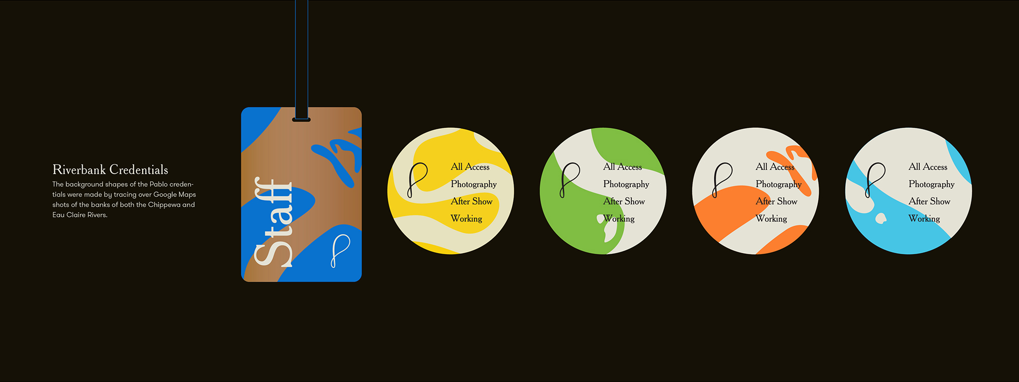
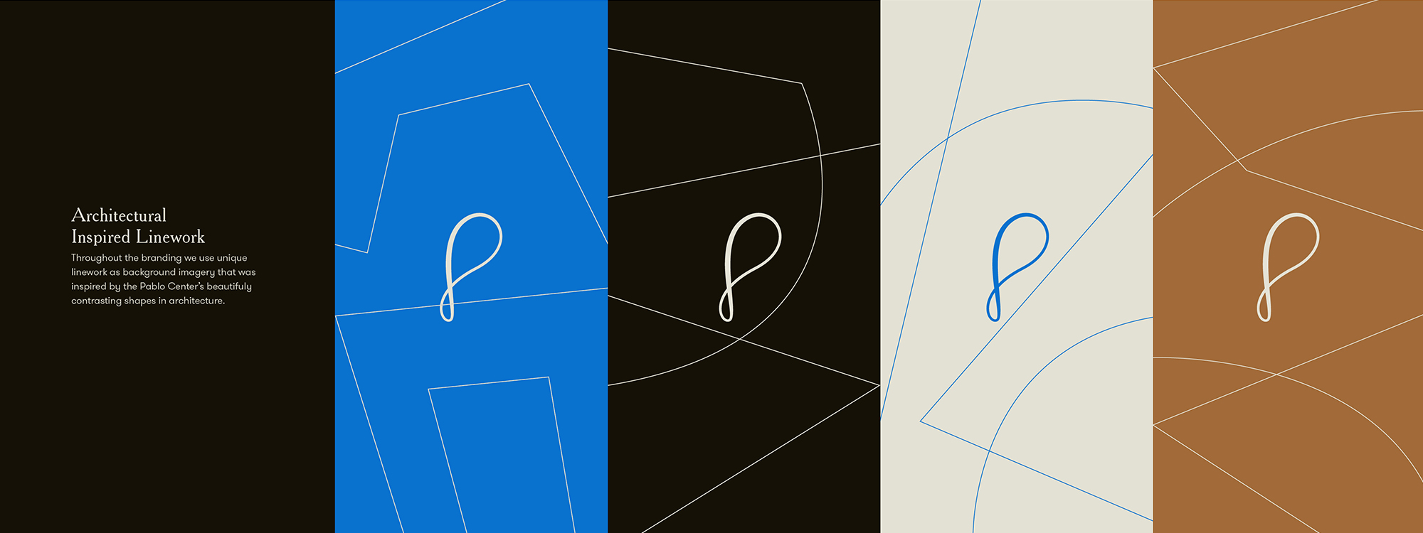
With circles turned on themselves to create the letters, there’s an implied depth through different line widths within the logo. We applied that same approach to the design of the icons that represent the different art forms that take place at the Pablo. The other branding elements we created are inspired by the banks of the Eau Claire and Chippewa River as well as the architecture of the arts center itself.
Knorth Team
RT Vrieze – Creative Direction & Design
Chris Bartlett – Photography & Video
Design
Creative Direction
Logo Design
Branding System
Visual Design
Motion Design
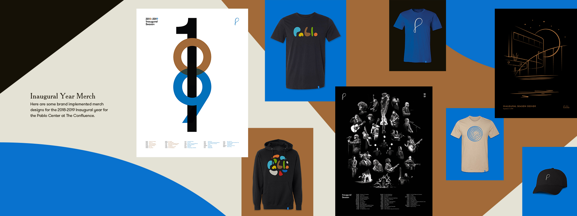
Merchandise
Strategy
Brand Strategy
Content Strategy
Content
Photography
Video Production
Post Production
Color Correcting
Motion Video Direction
Motion Video Production
Narration Editing
CONTRIBUTORS
Pablo Center – Photography
Lee Butterworth – Photography
Mike Howard – Photography
Ambient Inks – Printing
